
How to choose colours to keep brand colours consistent across designs?
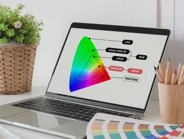
When designing for a brand, you should first consider what tools you will use to promote it and how you will maintain colour consistency across platforms. The consistency of brand colours is often overlooked, as is the fact that they are displayed differently in print and digital formats. It is therefore important to assess whether the brand will be rendered digitally or in print and choose the most appropriate colour mode (RGB or CMYK) accordingly.
Which colour mode to choose for your design – RGB or CMYK?
If your design is to be displayed on a digital screen, it is best to choose the RGB colour mode. RGB colours are used for web and app designs (buttons, graphic elements, icons), brand visual identity and promotional content (logos, graphic elements, online ads), social media posts and other visual content used in the digital space.
If the design project is required for print and physical products, it is best to choose CMYK colour mode. CMYK colours are used for brand representation and promotional print such as emblematic stationery, business cards, shop signs, posters, flyers, brochures, t-shirts, mugs, etc. It is worth bearing in mind that the CMYK mode is more limited in terms of colour and may not always be able to render specific shades such as RGB. However, the final choice of mode will depend on what your design will be used for.
Moving a design from one colour mode to another
Transferring a design from RGB to CMYK is more difficult than from CMYK to RGB because of the wider range of RGB shades. Let's say the trend in the design world right now is for bright, neon colours. Such colours are only produced with RGB, so their use is only possible if the brand is digitally oriented. In physical form, neon colour tones are rendered in a completely different way and do not reflect the real colouring of the design. If the transition from RGB to CMYK is done automatically by the software, the colours can often appear very muted or just too saturated. For this reason, it is recommended that, for example, logos be created in CMYK first and then switched to RGB if necessary.
In general, for consistency, it is often better to start with the more colour-restricted CMYK palette, as you are sure to find a match for your chosen colours if you want to move the design to RGB. Whereas you may be disappointed when you initially select colours from the RGB palette, you may be disappointed when you move to CMYK mode, as it is likely that you will not find a match for the colours you want. In addition, all conventional commercial printers and printers in your home use the CMYK 4-colour printing process.
Why is it recommended to choose „Pantone“ when designing?
Using colours from the „Pantone“ systemised colour system is one way to keep brand colours consistent. Each „Pantone“ colour has its own number. Once you have selected your preferred colour from the Pantone collection, you can use the specified RGB and CMYK values (colour codes) in your layouts. These values are calculated by „Pantone“ by measuring the spectral data with a spectrophotometer. One of the main advantages of using this colour system is that the colours are reproduced with extreme accuracy. The „Pantone“ system has many more shades than CMYK and is particularly characterised by its variety of orange and green shades. However, before you plan to create a project in Pantone colours, you should check in advance where you can print your design, as not every printer can print in these colours.
A new approach to colour workflow
We have talked about how design colours are routinely chosen. But there is also a new approach to colour mode selection. If we consider that RGB (sRGB) gives the highest colorimetric potential (100%), then CMYK (FOGRA39) will only give 80% of the potential. The percentages given are not the result of a scientific calculation – they are given to give a general picture. We could always start the design process with CMYK to ensure that the colours match in print and digital. But is this really a practical choice in a world where virtual channels have become perhaps the main means of distributing brand information?
As printing solutions improve, it is increasingly being considered that it might be more optimal to first create designs in RGB colours and only adapt them to CMYK as the need for physical print products arises. Today, modern large-format inkjet printers and digital presses are already equipped with cartridges in 6 or 7 colours (e.g. cyan, magenta, yellow, black, orange, violet and green). These allow printing in a colour gamut close enough to RGB (sRGB). In addition, some digital presses can print up to 97% of the colours of the „Pantone“ system, e.g. „Konica“ claims to print 87%. Of course, in the world of graphic design, it is still difficult to break stereotypes and change a workflow process that has been in use for years, but it is worth considering.
More ideas
Our Company
Help
© 2025 Flexpro. All rights reserved.
- Privacy Policy
- Cookie Policy
- Terms & Conditions

- Find the product you want. Search via the search or the category menu at the top of the page
- Select the product (or products) features. Standard print product characteristics are: material (thickness, type, colour of paper, cardboard or plastic), size, shape, orientation.
- Choose which print you want on one side or both.
- Please indicate how many units of the printed product you will buy and on what day you would like us to deliver it to you.
- Decide on the design. You can upload a ready-made design, create a new one, use our design template, or order a design and layout service.
- Add the product to your shopping cart. Be sure to check your shopping cart information.
- Choose the right delivery method. We delivery to parcel lockers to various European countries.
- Decide on the payment method: Choose one of the available payment methods: Google and Apple Pay, Visa or Maestro card, electronic banking via Paysera, bank transfer.
- Pay for your order and receive an e-mail from us confirming that your order has been accepted.
- Receive e-mails from us: "Your order is in production" and "Your order has been dispatched".
- Receive your ordered print product!
If you have any questions while browsing or ordering, please do not hesitate to contact us.